


Sunscreen semiotics and a bold disruptor
Meet Vacation, an 80s-inspired brand shaking up the category


If you’re someone who is interested in skincare (or perhaps not), chances are you’ve read or heard about the paramount importance of sunscreen, especially in recent years. What was once a “nice to have” in our routines became a non-negotiable.
While consumer appetite for sunscreen has grown, the category itself continues to use largely the same cues. The language is almost always functional. It’s associated with safety, protection – using scientific terms like “UVB / UVA protection” / “broad spectrum” and of course the numbers SPF 50, SPF 30 with lots of + signs tacked on top (did you know, those plus signs correspond to how long the filter protects you for?).
Other than protection, sunscreens will talk about finish, texture or viscosity – no white cast, non-greasy, dry-touch, lightweight, no white streaks, etc. Again, still functional. And then there’s the restricted use of color – orange and yellows to represent the sun, or blues to represent the ocean…
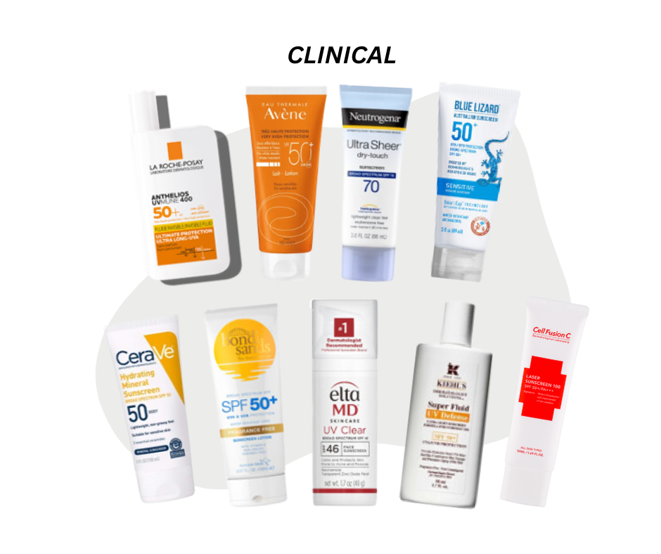
Thankfully, we have started to see sunscreen brands diversify in recent years – borrowing cues from skincare with fun, design-forward packaging – unconventional colors, interesting shapes and applications, punny names. To inject a sense of “fun”, they often employ intense, bright, neon color tones (differing markedly from their predecessors). But the brands all have one striking similarity. They are geared towards modern sensibilities– notably minimalism– which is linked to modernity. Perhaps this is because sunscreen is closely tied up with technology and innovation, hence packaging should reflect that.

So if the sunscreen category is all about functional benefits, innovation and technology, what could a retro 80s-inspired brand have to do with it?
Enter: Vacation. When we first discovered this brand here at Yuzu, we were instantly transported to another era – evoking summer à la Baywatch or the iconic 80s in Miami. This is the first time we’ve experienced a sunscreen brand– perhaps even a skincare brand– elicit such strong imagery and commitment to a brand universe.
Global Chief Brand Officer and sociologist Ana Andjelic refers to these as ‘galaxy brands’. She argues:
“Galaxy brands don’t revolve around heritage, craftsmanship, or the exceptional product quality (in contrast to brands like Hermès, Chanel or Brunello Cucinelli). Instead, galaxy brands invent a mythical story and emphasize narrative, merchandising, and the atmosphere of the environments where this story can be lived through brand experience and products.”
So while the rest of the sunscreen category focuses on exceptional product, i.e. tangible benefits, Vacation is a breath of fresh air that imagines a lifestyle, an experience, a universe of its own that feels both familiar (in our shared collective history) and unfamiliar (for the category).

From a semiotics perspective, the packaging borrows cues from the 80s, summoning plenty of signs filled with meaning. What first stands out visually is the use of icons. There’s the signature italicized 80s font that mimics hand-brushed writing. Next, the classic palm tree icon that you might have seen all over South Beach signage back then. Unlike its “modern” counterparts, its colors are softer and tinted; its yellow is a deep, richer yellow as opposed to neon.
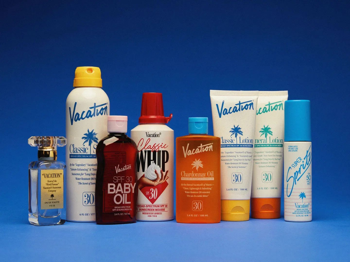
In terms of text, the actual name of the product is “Classic Lotion” – a very different vocabulary from the modern, skin-care driven language used today (apart from ‘sunscreen’, we observe: ‘Skincare Gel’ / ‘Sun Primer’ / ‘Sun Ampoule’ / ‘Sun Protector’). The copy that follows is: “By the “Legendary” Vacation® of Miami – “Leisure Enhancing” & “Excessively Good” Sunscreen for “Long Days by the Pool”… “The Scent of Summer”. Rather than highlighting technology or innovation, the copy highlights the emotional benefits of the product – to feel good, to enjoy life, and to feel relaxed.
Overall, these signs come together to craft a universe evoking nostalgia for a time believed to be more experimental, carefree, and focused on pleasure/enjoyment. Notice this is a stark contrast to the minimalism we see within and outside of the category today!
Next, let’s take a look at some of their key visuals – there’s a clear nod to the ads of the 80s, particularly those by Club Med as co-founder Marty Bell admits. Of course those ads were contextually different, usually appearing in magazines as compared to today’s social media. But there is something strikingly refreshing about seeing an ad today that isn’t allergic to copy. The key headline reads: “Leisure Enhancing Sunscreen”. The body copy leverages sensory imagery to evoke an aspirational experience – e.g. “From the gentle brush of the warm waters to the soft whisper of the summer breeze.” Compare this to the rest of the category that focuses on protection, safety.


Interestingly, the largest audience for the brand is not the generation who actually lived through the 80s, but rather Gen Z. Rather than nostalgia, there’s a word for this – anemoia (nostalgia for a time or a place one has never known) and it’s proving to be a powerful branding tool. Since launching in 2021, Vacation reported 500% YoY growth in monthly DTC revenues in one year and expects to do $40 million in sales in 2024.
In general, the 80s seem to have captured Gen Z’s fascination for the moment – evidenced by the recent TikTok trend where Gen Z ask their parents to “dance like it’s the 80s” to the 1984 track Smalltown Boy by Bronski Beat.

 Tiktok failed to load.
Enable 3rd party cookies or use another browser
Speaking of anemoia, it’s also worth checking out Seth Rogan’s Houseplant, NA aperitif Ghia, and cult-streetwear label Aimé Leon Dore (which perhaps deserve their own article to follow).
As a final note, there’s a question on our minds for the future of Vacation: While it certainly stands out from the rest, sunscreen is a category where science is top of mind. Can anemoia and innovation effectively go hand-in-hand? Will it be enough to secure loyalty for years to come?
This article was written by Elena Kim, a Senior Strategist hailing from the Yuzu Kyodai Singapore office. An anthropologist and storyteller, she decodes culture and consumers through a distinctly ‘third-culture’ lens. Her lateral curiosity fuels her passions for beauty, art/design, music, and wellness.
 | A guest post by
|